Rob Middleton, or Mid, is known for both – playing in a great stenchcore act DEVIATED INSTNICT and providing great artwork for bands all over the world, which I’m sure you know very well. Mid is still active in both spheres keepig himself very busy. So let’s see what the creative side of his has to say when we talk art, artwork and music.
Note: the interview also appeared in a Polish fanzine called CHAOS W MOJEJ GŁOWIE. Here, is the English version.
SP: You are the artist who has done a lot of artwork for punk/metal bands since the mid 80’s. But before your first work got released, tell us how it all started. When did you discover the flair for drawing and at what age?
Rob Middleton: Well I’ve always loved drawing, I remember as a kid doing these huge drawings on the back of old rolls of wallpaper. Designing crazy vehicles and drawing insane battle scenes with hundreds of little people in them, ha ha. I don’t think I ever thought I had a flair for it or that I was any good, I just liked doing it. The stuff I did during art classes at school was always pretty rubbish mainly because I was just lazy and hated being at school. I guess it wasn’t until I started doing little punk related drawings and stuff for my own bands that I began to have any confidence in my own ability.
SP: BTW, do you remember your first art for a band that made it outside to the real word? What was it?
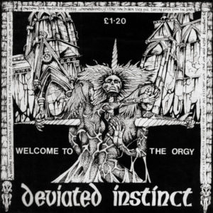
Rob Middleton: The first time I got to do anything on a record cover that was actually printed and sold in shops was in 1985 for a compilation album called ‘Words Worth Shouting’ that was on the local label Radical Change Records. This was partly run by a friend, Steve who was the singer of the Norwich punk band THE DISRUPTERS. He’d seen my drawings on the very early DEVIATED INSTINCT flyers and handouts that we used to give out at our first ever gigs and just asked me if I’d be up for doing the cover art on the compilation he was working on. DEVIATED INSTINCT also got a track on that LP which was our first proper recorded song.
SP: Did you teach yourself to draw or did you take lessons? Who or what was your inspiration?
Rob Middleton: Even though I’ve done lots of different art courses over the years I don’t think I’ve actually been ‘taught’ to draw. I don’t use any particular techniques that I’ve been taught. I’ve learnt a lot about the way to approach a subject and think about your work but mostly like anything it just comes down to practice. The more you draw the better you will become. That’s something I need to constantly remind myself of. I don’t draw every day and I really, really should. My original inspiration back in the 80’s was either punk cover artists like Nick Blinko, Squeal, Pushead and Nick Lant plus also comic artists like Glenn Fabry and Simon Bisley ( as I was a huge 2000AD nerd). Then when I started doing more collage, mixed media and early digital work I was somewhat obsessed with the work of Dave Mckean for a good long while.
SP: You did BA in the art school. Did it shape your style, gave you more knowledge, perhaps secured a job of some sort?
Rob Middleton: The course I was on at Art School was called ‘Visual Studies’ and was a kind of multi-disciplinary course. Rather than just immediately focussing on one aspect like you would on a painting, sculpture or printmaking course we got to do loads of different stuff from welding to animation. There was also quite a heavy conceptual element to it all plus theoretical and art history studies. Then during the last year or so you just worked on your own projects in a studio space. It was a really fantastic experience and I loved every second of the three years I was doing it. My personal work developed more over those three years than at any other time before or since, I wish it could have gone on forever. The degree itself hasn’t helped in getting a job or anything but as a general life experience (I also went on field trips to Florence, Barcelona and Berlin during the course) and just developing myself as an artist I felt it was invaluable.
SP: Did you plan to continue studies and perhaps do MA? Do you believe that getting degrees in a given subject changes something about you and your future? Or it is not a degree that matters?
Rob Middleton: Yeah the degree itself is little more than just a piece of paper and I guess there are jobs where they ask for qualifications at degree level (when not really caring what the degree is actually in) so it can be useful in theory. As I said in the previous answer just the experience of being on the course and in that art school environment was really great. I think now it is harder and harder for people to do that because of changes in funding where you have to have money and/or get in crazy debt to be able to do any higher education over here. I was lucky in that when I did my degree it was the last years when you were still able to get some grant help and the fees paid. I still had to take out student loans (but just nowhere near as much as students have to today). I got a letter from the student loans company recently telling me that because I just turned 50 that my debt has been cancelled. I guess there are some advantages to being ancient, ha ha. As for an MA, I would have loved to go on and done a masters degree. There used to be a great drawing masters at my local Art School that I’d briefly considered doing but I just couldn’t afford it and now it would be impossible. Who knows maybe one day, I’d love to be a student again plus I think I need that kind of impetus to shake my work up again.
SP: How would you characterise your style and the way it evolved throughout the years?
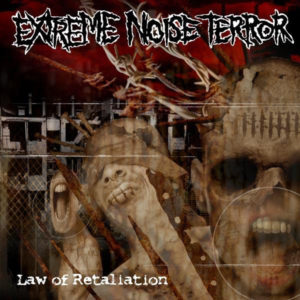
Rob Middleton: I’m really not sure that I have a style. I like working in so many different mediums and hate to restrict myself to one kind of work. For example I could spend a while doing a couple of small, really detailed illustrations in pen and then do some large scale relief abstract work using plaster, wood and wax. Then I’d feel like a change and do some oil painting after which I’d be working on a rapid 6 foot charcoal drawing. Unfortunately since I no longer have a studio space and just have to work at home in my flat I can’t really make large, messy work at the moment. Sometimes I worry that I spread myself too thin with different kinds of work and that I should just concentrate on working in one medium to establish a style and identity but I think I’d just get bored. Maybe I’m just a jack of all trades and master of none but it keeps me interested. I think it did evolve quite dramatically from the 80’s and through the 90’s but I’ve hit a bit of a creative wall over the past few years. I think I need to shake things up a bit and start taking a few more risks.
SP: I noticed that your first art work, especially for DEVIATED INSTINCT was black and white, but now you work with colours. Was it a natural evolution or a decision?
Rob Middleton: Well, obviously the early work for D.I and all work within the punk scene at that time was monochrome generally because all art within the 80’s Anarcho Punk scene where we came from was predominately just black and white ink or collage work. There wasn’t even colour photocopiers back then so if it was for handouts or flyers or anything we were printing ourselves it had to be one colour. I simply moved into colour when bands I was working for had labels that could afford to print in colour. I still remember my first ever full colour piece which was for the ANIHILATED album ‘The Ultimate Deseration’ in 1989. It seemed very exciting and decadent at the time. So it wasn’t so much a conscious decision but just based on what was available.
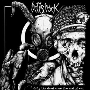
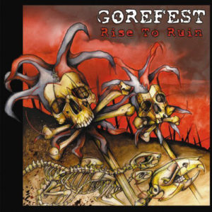
SP: You are known for having done art for a few NAPALM DEATH, GOREFEST, HELLSHOCK albums that are very popular both music wise and visual art wise. So when people see the artwork for ORPHANAGE NAMED EARTH they say: Is it really Mid? He works for big names, how come? So who do you really work for? Can anybody approach you and ask you for a cover art?
Rob Middleton: I have to say it’s a long, long while since anyone I’d consider a ‘big name’ approached me for any art. I mean Hellshock were still just a new band when I first did covers for them. Obviously NAPALM DEATH were a big name but as I’d always known them and I’d grown up seeing and playing with them it wasn’t totally out of the blue. Yes, anyone can approach me but I do seem to get less and less serious offers plus I’m becoming a lot more choosey. I have much less spare time to do my art these days so I feel I have to really get something out of it. It has to inspire and excite me. If I’m really not into the music or I feel the ideas the band have are too restrictive or not what I would choose to draw I simply say thanks but no thanks. Plus a large majority of people who approach me seem to want something for nothing, people seem very reluctant to spend any kind of sensible budget on art. They’d never think of approaching a studio and asking them to record their album for a few quid and some free merch but think nothing of asking for artwork like that. I consider myself very reasonable and flexible when it comes to pricing but a lot of people just never reply as soon as money gets mentioned.
SP: Do you get many asks from bands to draw art for albums, t-shirts?
Rob Middleton: As I mentioned in the answer before, it seems to be less and less. In some ways I seemed to get more interest when it was harder to actually track me down. Before the internet I would get letters in the mail from bands who had seen record covers I’d done. Now everyone has a website and an instagram and a tumblr and whatever else. There are so many artists of all kinds out there and a lot of very similar work. There’s almost too much and it’s hard to pick through it all. There certainly were times when I’d have a constant backlog of projects but right now I think I probably only work for one or two bands a year. Looking back at those very busy years when I had more time there’s a lot of stuff that I’m really not very happy with where I feel I was compromising too much so to be honest I’d rather do one really fulfilling project for a band than ten I’m really not that passionate about.
SP: How did the NAPALM DEATH story start? Was it one of those moments hell yeah, finally reaching a wider audience or just another project treated with equal respect and professionalism?
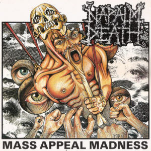
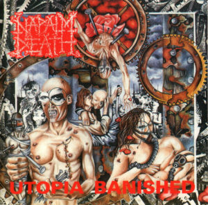
Rob Middleton: As I mentioned earlier, I’d been in the same circle as NAPALM DEATH, we played with them a lot in our early days around 1985/86. I’d known Barney from before he joined ND when he was just this kid Barney Rubble at the Mermaid. Obviously when the whole UK scene blew up and grindcore became a big thing NAPALM DEATH’s popularity skyrocketed. They were certainly at the pinnacle of the scene so it was still a real buzz when they first asked me to do some art for them. I think the first thing they asked me to do was the T-Shirt design for their Grindcrusher tour of about 1990, a design I think they still use. Then over a few years I did quite a few different shirt designs for them plus 5 or 6 different record covers. It was absolutely the biggest break for me and even though they’ve been using various different artists for many years and it’s been a long while since I worked with them it still seems to be the number one reason why many bands approach me. I’m not sure that some of the stuff I did for them has aged very well but I was definitely happy with most of it at the time and it was a huge privilege to get to work with them for so long and for the freedom they gave me with the work. Most of the shirt designs I did for them are still being printed and I still get a buzz any time I see someone wearing my artwork. However I do still get people now asking if I can do work for them in the style of Utopia Banished or something but I’ve not worked like that for decades so I generally politely decline. Plus I’m not really into much grindcore or death metal these days so bands would have to be something a bit different and special to grab my attention in those genres now.
SP: When I asked you to draw the logo you said you hate doing logos? Why is that so? Is it because it is difficult to come up with something original or the fact that you can get any font these days so piss of and use the internet or something else?
Rob Middleton: Ha ha, yeah, I really do hate doing logos but you were very persistent and wouldn’t take no for an answer. I think I’ve been asked and declined several other logo designs since then. I think people assume they’re simple easy work and maybe they are for some people. I don’t consider myself a designer though and just think they’re more trouble than they’re worth. Trying to come up with something eye catching and clear that’s not been used before is next to impossible. We don’t even have a decent logo in our own band!!
SP: What is your approach for drawing commission work? Do you prefer to be told what to draw in terms of content or knowing the band, lyrics, etc is enough?
Rob Middleton: My very favourite commission work would be someone saying “Here’s our music, listen to it and do whatever you like in response” and then just having total trust in me but that very rarely happens. A lot of times bands will have some very vague ideas of what sort of style work they like and some basic themes they’d like the work to portray. I have often worked just from lyrics or song titles. If a band has a very specific idea of exactly what they want and asks me to draw something from their mind’s eye I’ll generally decline now. There’s nothing worse than trying to make the best out of someone’s bad idea. Plus when I have done that even though I’ve done my best to draw exactly what they’ve described they’ll say “oh, it wasn’t really how I’d imagined it” or ask me to alter a piece of work and take out the one element that I feel makes it work. It’s too frustrating and I don’t have the time or patience for that anymore.
SP: Your art often includes ravens skulls, humans muscles and insects. Why is it so? Are you open to drift into other directions?
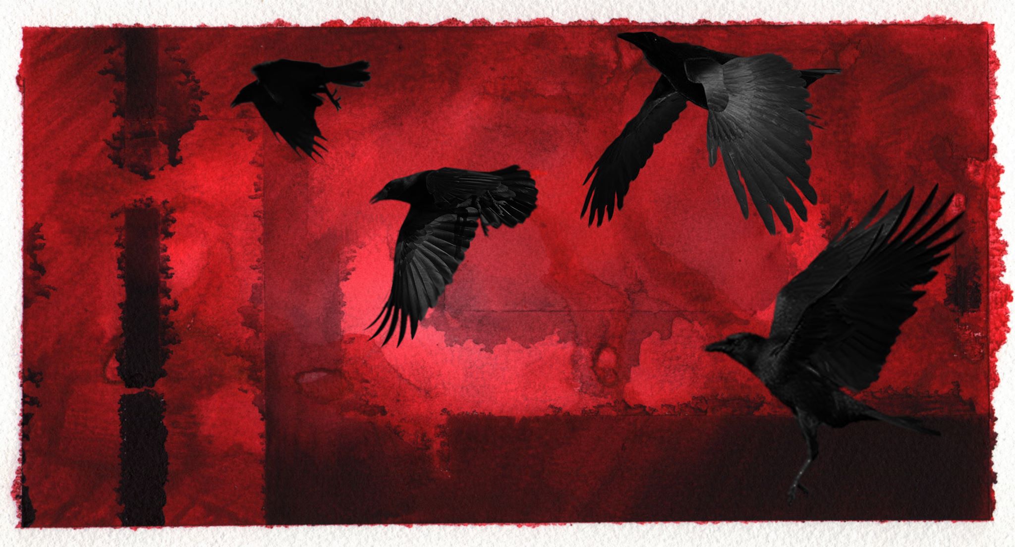
Rob Middleton: There’s no deep reason behind any of the imagery I have used, just whatever is interesting me and inspiring me at a particular time. I’m pretty sure ravens and skulls will always be there, I mean they’ve been appearing in my art for the past 30 years so why stop now? ha ha. For a while I was very interested in the human form from a very anatomical point of view although that seems to have drifted out of my work as I’ve been more inspired by the natural world, plants, animals etc. Obviously I’m always open to drift in any area, in fact I think it’s vital. At the moment I feel like things have stagnated a bit plus there are countless other artists all working in the same areas with similar themes. It’s difficult to try and keep things fresh and with your own identity when because of social media you are constantly aware of so much other work. At the same time it’s important not to try and force things and let the process take on it’s own momentum.
SP: I have also noticed that your trademark are thorns, usually growing out of circular objects? What is the message behind it?
Rob Middleton: Again there’s no deep underlying message and I’m not really interested in creating trademark theme’s, often I’ll add elements purely as a stylistic decorative edge. Generally I’m much more interested in the aesthetic of a piece rather than trying to convey a message or meaning, I’m happy to leave it open to personal interpretation. People can take from my work what they like. When I was at art school, especially on my course there was a real focus on having to justify everything you did. In the end you kind of get sucked into that whole pretentious art speak and start to create pretentious reasons for everything and believe your own bullshit. For a while afterwards I found myself almost paralysed and unable to make work because of feeling like I had to justify everything. This isn’t to say that I never make work with meaning, it depends on the situation or commission but it’s not my primary concern or driving force.
SP: Looking at your work, one can quickly distinguish a few artworks that differ in style from the others. For example: SUICIDE WATCH– Figurehead Of Pain, OUT COLD / VOORHEES – Everything You Believed In Was A Lie, KNUCKLEDUST – Time Won’t Heal This, NAPALM DEATH – Hung and SPINE WRENCH records. Why? Do you sometimes experiment or those bands wanted a change?
Rob Middleton: Hmm, it’s interesting that you would pick those few. The cover for the SUICIDE WATCH record wasn’t actually for that. It was initially commissioned for and used on a CRO-MAGS tribute album on Blackfish Records. It’s why it has a very vague sort of Krishna vibe about it. Ian who played bass in SUICIDE WATCH ran Blackfish Records and when the CRO-MAGS tribute was out of print just decided to use the art again on his own bands record which seemed a strange thing to do but he owned the painting so it was his choice.The OUT COLD / VOORHEES cover was just a quick digital collage. I think the cold and brutal nature of the imagery I used summed up the violent rawness of the music. The KNUCKLEDUST cover was from a time when I seemed to be getting asked to design the cover for almost every UKHC band at the time plus I was doing a lot of digital design work. It was sort of new style at the time in those early photoshop days. Looking back at all those records I pretty much hate all that old artwork plus I was never into the whole tough guy hardcore/metalcore thing so I couldn’t get very excited about all that. Those records I did the whole cd inlay and package design though so it was good to have control over all the layouts and so forth and be able to totally immerse myself in it. I can’t remember where the ideas for the covers came from though. NAPALM DEATH ‘Hung’ I think was a last minute thing where they needed something really quick and just asked if I had something lying about they could use. Spine Wrench, well obviously this was my old band and I was just experimenting with different sounds and different style graphics after D.I broke up (the first time around). I just wanted to do something that was different plus was influenced by a lot of minimal and bleak industrial graphics.
SP: Is your visual art discography on Discogs complete?
Rob Middleton: Until you mentioned this I had no idea I even had a visual art discography on there, thanks for the heads up, ha ha. Having a quick look, no that’s not complete. I haven’t actually got an up to date list anymore, I think I need to sort that out. I used to keep a list of all my works on my old (now dead) website. When PROFANE EXISTENCE did a feature on me and my work in issue 46 of their magazine in 2014 they printed a full list for the time but it only goes from 1985-2014. Looking back at that they’ve listed about 75 covers, I guess there’s been a fair few since. For a while I was almost doing a record cover a month but as I mentioned before at the moment they’re few and far between so my list is growing very slowly at the moment. I’d like to think it’s quality not quantity that’s important now though.
SP: As a DEVIATED INSTINCT member, If you were to ask a different artist to come up with art for the new album, who would you cooperate with and why?
Rob Middleton: That’s a very interesting question. I think that would be very difficult for me because I’m such a control freak with my own bands. Obviously there are many artists whose work I love but who would I trust to come up with something for D.I? Hmmm….probably someone like Jeremy Hush (who’s done stuff for BLACK TUSK, DRESDEN, WAKE UP ON FIRE etc plus all those amazing drawings in SLUG AND LETTUCE over the years), he’s been involved with the same scene so would understand where we’re coming from plus his imagery would definitely fit in with the aesthetic of the band at the moment. He’s also one of the most naturally talented artists I know (and a really nice guy) so would be easy to work with. I’m fairly certain I’d be blown away with anything he would do.
SP: Some of your works end up on people’s skin as tattoos? Have you ever thought of becoming a tattoo artist?
Rob Middleton: No, it’s just not for me. I have had offers. I have a good friend Mik who plays in Coitus and who I played with in a sludge band called Teratoid for a couple of years. He’s a professional tattoo artist who works in a great local studio. He offered me his spare kit to borrow to practice with and to show me the basics but I just wasn’t interested. I think I’m too fussy about what I’d want to draw and on who, plus I’m really not a people person, ha ha and it’s kind of impossible to avoid people if you’re drawing into skin. I do get a real kick out of seeing my art used for tattoo’s though and I have been asked to design tattoos for people in the past. I’m quite happy to let someone else do the inking though. I think there’s probably too many tattooists in the world right now and no one really needs another not very good one, ha ha.
SP: What is your favourite visual art that you are 100% happy with and proud of?
Rob Middleton: I’m really not sure I am 100% happy with anything. I really am my fiercest critic. After I’ve done a piece of work I generally really hate it and can’t look it again for months. It’s often not until I go back to look at something months or years later with fresh eyes that I can appreciate it at all. Probably my favourite cover painting I’ve ever done is the STAMPIN’ GROUND ‘ An Expression of Repressed Violence’ from 1998. I was pretty happy with that at the time and going back to it now am still really satisfied with the work. I think even if I did that now I’d be happy. Also even though I have issues with various elements that I did on the front cover of the LANDMINE MARATHON ‘Gallows’ album I am still really happy with the overall feel and identity of the package and all the back and inner sleeve design work I did. Also even though it’s a 100% digital collage that I don’t really like working in any more I am still really pleased with the full package design I did for my old band BAIT’s ‘Anatomy of Disaster’ album in 2004.There are a few pieces of personal fine art work I did either at the end of my degree course or soon after when I had a studio that I still feel passionate about when I was working with mixed media on quite a large scale. I miss being able to work like that at the moment. That’s something I’d really like to get back to doing in the future. I’m feeling quite frustrated tied to small detailed work at the moment.
SP: To finish off, which artists from the past in your opinion influenced the contemporary art, styles, etc.
Rob Middleton: Do you mean as in regular artists as opposed to artists within the punk scene? I don’t know, that’s a huge question that would require an equally huge answer as there is such a wealth of stuff out there of all different styles. I’m seeing a lot of Art Nouveau influence in a lot of people’s work at the moment so I’d say Mucha especially is a big influence, certainly on me. I saw a lot of his original drawings and prints in Prague recently which just blew me away. I think there’s a renaissance in figurative surrealistic stuff as well that obviously owes a lot to Dali. Plus the large scale super realism seems to be a trend at the moment which Chuck Close was a pioneer with back in the 80’s. Those are just a few that immediately spring to mind. Oh and there’s a some amazing dark illustrative work being done right now by a lot of talented folk obviously inspired by greats like Arthur Rackham and Aubrey Beardsley.
SP: Any punk artists gurus whose works you admire and think that they influenced the artistic side of punk?
Rob Middleton: Well I think I already mentioned all the big hitters from the past that I found inspiring. Now though there are so many amazing artists within the punk scene, many I’m happy to consider friends. People taking things on to new levels. Stiv from Visions of War, Brian D’Agosta, Sonia Lord, Jeremy Hush, Skinny and many, many more. All I know is I need to up my game, ha ha.
